Friday, March 14, 2014

Room for two


Hello everyone!
Today I would like to share the most playful project I have done yet. I was asked to design a room for two boys aged 4 and 8, and to make it fun and comfortable for both the kids and the parents.
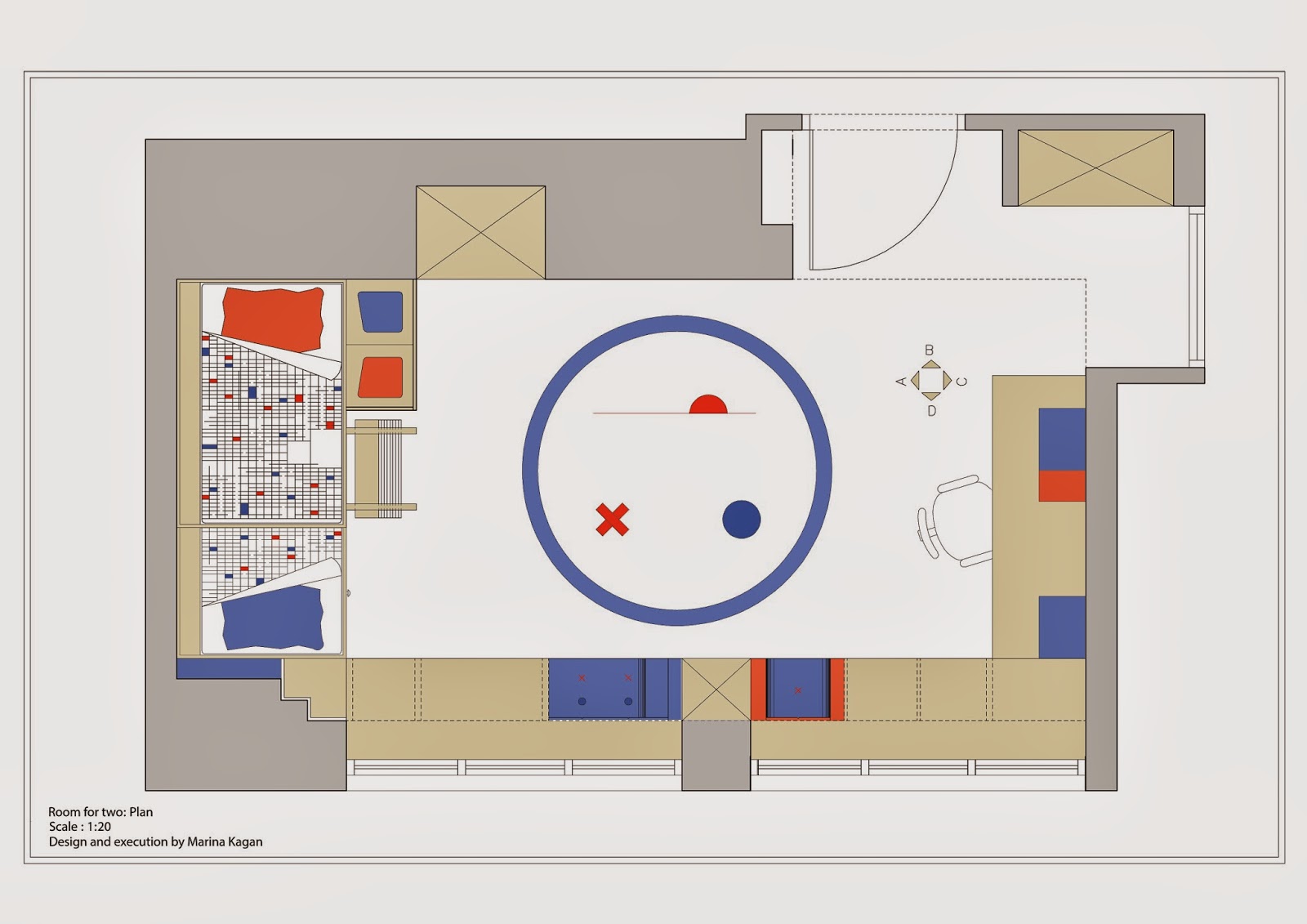

The project is situated in an old building in Manhattan, and thus the walls were irregularly shaped and had built-in niches. I used the niches for storage, leaving lots of space for play. The brothers would share a double bunk bed, and each of the beds got a personal hiding place for alone time and reading.


I layered the windowed wall with a low cabinet that functions as a long bench, a desk for the younger brother, and that incorporates a sofa and a couch (elevation D), while allowing all available sunlight in.


Playfulness of shapes and colours was my basic visual concept as well as the famous children's game cross and circle, so I utilised diagonal lines to break down the severity of the super functional boxes and doors. A magnetic whiteboard is a major feature in the room, encouraging creativity and learning experiences.


Even more seats are available in the low cabinet, ready to be pulled out and used.


A nice and well illuminated desk for the older boy.


I had also softened all sharp corners with upholstery, using faux leather fabric which is very easy to clean...

I hope you enjoyed this project, I know I did!

Tuesday, February 25, 2014

Light as a generator of Time, Motion & Space


"Light Islands" - my subway station. 

Hey readers!
Here are some pictures from my final project my good old days at college. Basically, the assignment was to design the interior and surroundings of a subway station that was structurally planned in advance (which means I couldn't change any of the structural elements), and was situated in Tel Aviv, Israel.
My basic intention was to create a beautiful space while reducing the need in artificial lights and air conditioning by letting natural sunlight in, and allowing spontaneous air circulation.
So, how did I approach this challenge, considering it IS underground, and quite deeply so?
My approach involved mapping the desired lighted areas, devising some smart perforated surfaces, and designing the interior accordingly.
Sounds simple, right?


Here you can see my plan for the upper floor of the station and its ceiling. Strict regulations and standards require leaving most of the floor space unoccupied in underground stations, but you may be able to see I have left room for shops and offices along the long axis and at its edges.
In the section you can see one of two amorphic domes, whose shapes are dictated by traffic constraints. These dome were analysed using climatic emulation software, and perforated in a fashion that allows the desired sunlight to penetrate the station in a controlled manner.


The entrances of a subway station set its visual character in many ways. For me that was a main issue. I wanted to have it looking light, structural, elegant and sculptural.

What a pity! Unfortunately I fear my project would prove to be quite a bit above the budget... Ce la vie!